5 Annoying Mistakes You’re Making with Your Restaurant’s Website
Do you remember when I said that you need a website? Well, now that you have one, let’s talk about website best practices.
AKA mistakes that are costing you customers AND money.

Don’t Make These 5 Mistakes with Your Food Website
1. Multiple pop ups
Most websites I’ve been to have at least 3 pop ups.
One for their email list, one for their 24/7 chat, and another pop up when you’re about to leave the page.
And food bloggers are notorious for this.
Now, some pop ups are necessary, like the ones for GDPR.
But most aren’t.
Why would someone want to join your email list when they don’t know much about you or your products/services?
If someone took the time to come to your website, they are most likely looking for quick information, such as your address or your menu.
And your barrage of pop ups is getting in their way.
2. Videos (and music) on autoplay
I don’t know when this became the norm for websites, but it needs to stop.
Automatically playing a video or music on your website is either going to:
- clash with the videos or music the person is already playing in the background or
- startle them because they weren’t expecting to get sound from your website
I’ve seen this often on food blogs that sometimes have 2 – 3 different video ads playing at the same time.
There’s nothing wrong with having videos on your website, but people should have the ability to choose whether or not they want the video or music to play.
3. Not optimized for mobile
Most people are on their phone.
How does your website look & behave on mobile?
I promise that if your website on a phone requires a person to scroll left to right, they will leave your website.
When you’re choosing a platform to build your website (Wix, WordPress, Squarespace, Framer, etc), make sure that it provides a great mobile version of your website.
4. PDF menu or even worse, no menu at all
Again, most people are on their phone.
Depending on phone settings, you have to download a PDF when it’s easier and faster to view the menu directly on your website.
But what’s worse than this, you ask?
Not even having your menu on your website.
How could you have a website for your restaurant, food truck or CPG product and not have a menu or a list of your products?
Oh, well my menu is in my Instagram story highlights, you say.
Well, let’s hope that the person who came to your website, most likely from your Instagram page, will go BACK to your Instagram page and dig through your highlights to maybe find your menu.
Yes, let’s hope.
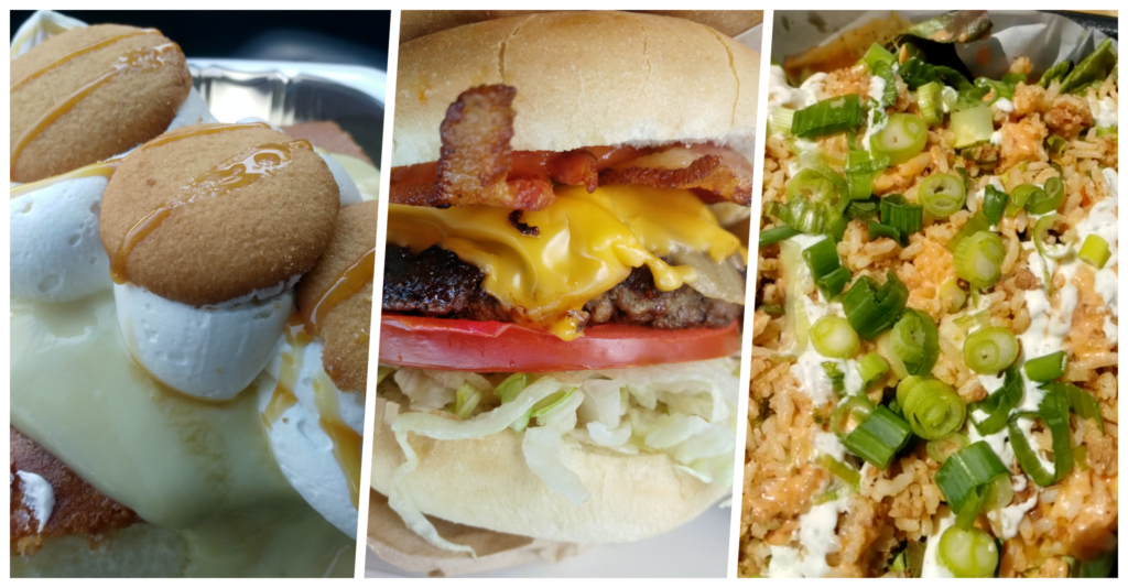
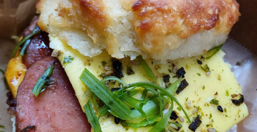
5. No images of your food
Gordon Ramsay said having food pictures on a menu is tacky, but surely you can have a few photos somewhere on your website?
Also, you can put pictures of your food on your menu.
Gordon Ramsay isn’t the boss of you or me.
This post is about website best practices for restaurants & food businesses
Yes, you need a website
3 Major Reasons Why You Need a Website for Restaurants, Food Trucks & Content Creators

